What Does Wifi Icon Look Like? Shape Clues
Introduction If you have ever glanced at a laptop, smartphone, or tablet and asked yourself, What Does Wifi Icon Look Like?, you are not alone. The wireless symbol is one of the most frequently seen icons in modern digital life, yet many people cannot describe
Introduction
If you have ever glanced at a laptop, smartphone, or tablet and asked yourself, What Does Wifi Icon Look Like?, you are not alone. The wireless symbol is one of the most frequently seen icons in modern digital life, yet many people cannot describe its exact shape when asked. It appears on taskbars, lock screens, settings menus, and public signage, acting as a visual shorthand for internet connectivity.
This guide breaks down the visual anatomy of the wifi symbol, explains how it differs across operating systems, and offers step-by-step instructions for finding, troubleshooting, and even customizing it. Whether you are trying to identify a strange symbol on your device or simply want to understand the shape clues that distinguish wifi from other wireless indicators, this article covers it all.
Table of Contents
- Introduction
- What Does Wifi Icon Look Like? The Basics
- The Anatomy of the Wifi Symbol
- Shape Clues: Arc, Dot, and Signal Waves
- Common Variations Across Devices
- Wifi Icon vs. Other Wireless Icons
- Color Meanings and Signal Strength Bars
- How to Identify the Wifi Icon on Different Operating Systems
- Step-by-Step: Troubleshooting When the Wifi Icon Disappears
- Customizing or Changing the Wifi Icon
- Accessibility and the Wifi Icon
- Tips and Best Practices for Recognizing Wifi Icons
- Frequently Asked Questions
- Conclusion
What Does Wifi Icon Look Like? The Basics
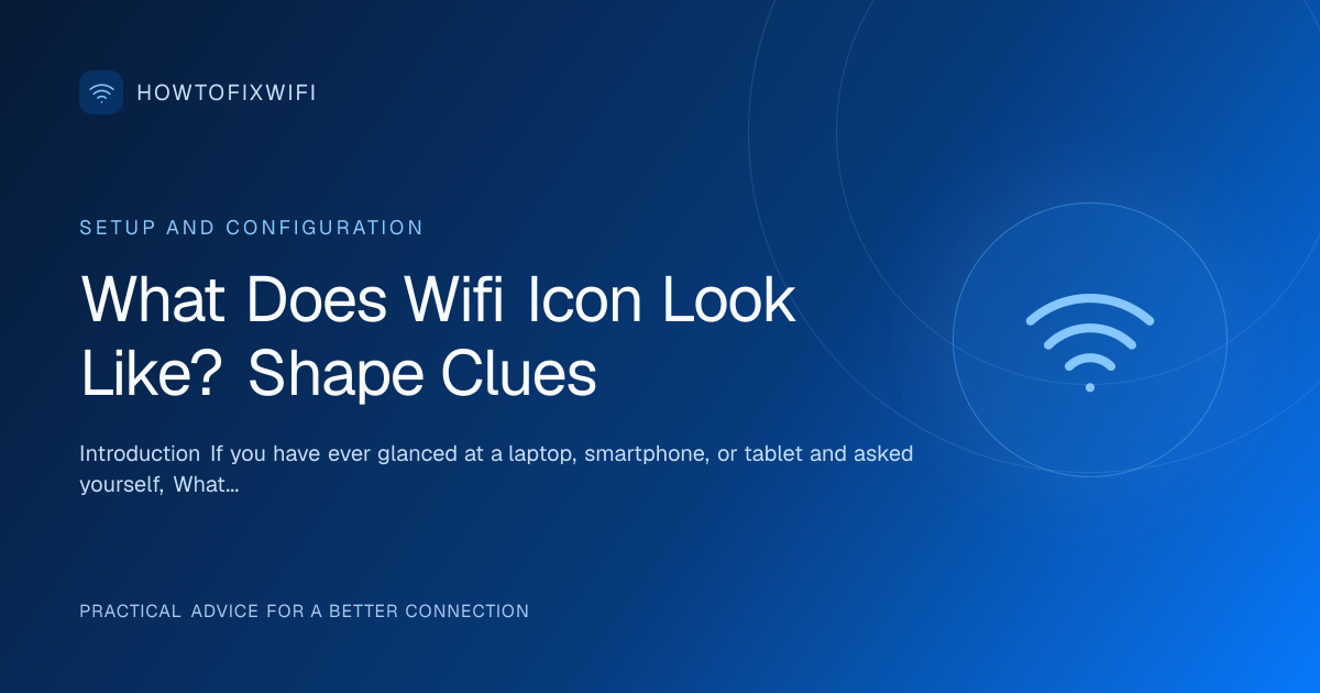
When someone asks, What Does Wifi Icon Look Like?, the most common answer is a small dot with curved lines radiating upward and outward from it. Think of it as a simplified radio signal. The dot represents the source, such as a router or access point, while the arcs suggest waves traveling through the air. This design is intentionally simple so that users can recognize it at a glance, even on a small screen.
Most versions of the icon use three arcs, though some designs show two or four. The arcs are usually concentric, meaning they share the same center point at the base of the symbol. They grow wider as they move away from the dot, visually implying that the signal expands as it travels. The entire shape is typically centered vertically within its container, whether that container is a menu bar, a settings page, or a notification area.
It is important to note that the icon does not usually include literal text, letters, or numbers. Its power comes from abstraction. You will rarely see the word “wifi” spelled out inside the icon itself. Instead, the shape does all the communicating. If you are looking at a device and wondering whether a symbol indicates a wireless network, look for that central point with expanding arcs. That is the core answer to What Does Wifi Icon Look Like?
The Anatomy of the Wifi Symbol
To understand the icon more deeply, it helps to break it into its component parts. Every wifi symbol, regardless of minor stylistic differences, relies on a few consistent visual elements.
The Central Dot
At the bottom center of the icon sits a small filled circle. This dot symbolizes the origin of the signal. In technical terms, it represents the wireless access point or router that broadcasts the network. Without this anchor point, the arcs would have no clear source, and the symbol would lose its meaning.
The Arcs
Above the dot are one or more curved lines. These are not random squiggles; they are carefully drawn arcs that suggest radio waves moving outward. The number of arcs often corresponds to signal strength, with more arcs indicating a stronger connection. The arcs are usually symmetrical around a vertical axis, giving the icon a balanced, fan-like appearance.
The Base Line
Some versions of the icon include a short horizontal line beneath the dot. This line can represent the surface of a device or the grounding of the signal. Not all operating systems include it, but when present, it adds a subtle sense of stability to the design.
The empty space between the arcs is just as important as the lines themselves. That negative space allows the eye to distinguish each wave individually. If the arcs were too close together, the icon would look like a solid blob rather than a series of expanding signals.
By recognizing these parts, you can quickly answer What Does Wifi Icon Look Like? even when you encounter a stylized or unfamiliar version.
Shape Clues: Arc, Dot, and Signal Waves
Shape clues are the subtle design details that help you differentiate the wifi icon from similar symbols. The most reliable clue is the combination of a single dot with multiple arcs. No other common connectivity icon uses exactly that arrangement.
Bluetooth, for example, uses a stylized rune that looks like a angular “B” with triangles. Cellular signal indicators use vertical bars of different heights. NFC symbols often feature a single curved wave or an abstract “N.” The wifi icon is unique because it pairs a central origin point with upward-curving arcs.
Another shape clue is directionality. The arcs almost always curve upward and outward, never downward or inward. This upward motion suggests transmission into the air. If you see a symbol with arcs pointing downward, it is likely not a standard wifi indicator.
Symmetry is also a clue. The wifi symbol is generally mirror-symmetrical along a vertical center line. If the left and right sides look different, you may be looking at a custom logo or a different type of wireless indicator altogether.
Finally, consider scale. The icon is designed to remain legible at very small sizes, such as 16 by 16 pixels. At that scale, the dot and arcs must remain distinct. Designers achieve this by keeping the lines thick enough to see but simple enough not to blur together. These shape clues make the icon instantly recognizable across devices and screen resolutions.
Common Variations Across Devices
Although the core concept remains the same, the exact answer to What Does Wifi Icon Look Like? can vary depending on the device and operating system you are using.
On Windows computers, the icon often appears as a series of white or blue arcs against a dark taskbar background. The number of lit arcs indicates connection strength. When the connection is limited, Windows may add a small yellow triangle or exclamation mark over the symbol.
On macOS, the wifi icon lives in the menu bar and typically uses black or white arcs depending on whether the system is in light or dark mode. Apple’s version tends to be more minimalist, with thinner lines and a smaller central dot.
Android devices often place the wifi icon in the status bar at the top of the screen. The icon may appear as solid white arcs when connected, or grayed-out arcs when disabled. Some Android skins add a small “!” or “x” overlay when there is no internet access despite a network connection.
iPhones and iPads use a similar approach in the status bar, but the arcs are often more condensed. The symbol may appear next to the carrier name or in the control center. Apple occasionally adjusts the thickness of the arcs between iOS versions, but the fundamental dot-and-arcs structure remains unchanged.
Web browsers and web applications sometimes use their own interpretations. A browser tab might show a small wifi symbol when a site requests location access or when a progressive web app is available for offline use. These versions are usually monochrome and simplified to fit alongside other browser controls.
Wifi Icon vs. Other Wireless Icons
Because many wireless technologies use abstract symbols, it is easy to confuse them. The table below compares the wifi icon with other common connectivity indicators so you can spot the differences quickly.
| Icon Type | Typical Shape | Key Visual Clue | Common Colors | What It Indicates |
|---|---|---|---|---|
| Wifi | Dot with curved arcs above | Expanding signal waves from a central point | Blue, white, gray, black | Wireless network connection |
| Bluetooth | Stylized rune or angular signal | Rune-like character or triangular waves | Blue, white, gray | Short-range device pairing |
| Cellular | Vertical bars of increasing height | Signal strength ladder without a central dot | Green, gray, white | Mobile network signal |
| NFC | Curved wave or stylized letter | Close-proximity radio symbol | Blue, black, white | Near-field communication |
| Airplane Mode | Airplane silhouette with signal lines | Crossed-out wireless signals | Gray, orange, white | All wireless radios disabled |
The most important takeaway from this comparison is that only the wifi icon uses a central dot with symmetrical arcs above it. If you see vertical bars, you are looking at cellular strength. If you see a rune-like shape, it is probably Bluetooth. If you see a crossed-out signal, the device is in airplane mode.
Color Meanings and Signal Strength Bars
Color plays a supporting role in how the wifi icon communicates status. While the shape answers What Does Wifi Icon Look Like?, the color tells you whether that connection is healthy.
Blue is one of the most common colors for an active wifi connection. It suggests that the device is successfully linked to a network. White is also widely used, especially on dark interfaces where white provides better contrast. Gray usually means the wifi radio is turned off or the device is not currently connected to any network.
When a connection is limited, some operating systems change the color to yellow or amber. A red icon often indicates an authentication error or a complete failure to obtain an IP address. A black icon may appear on light-themed interfaces simply for contrast, not because something is wrong.
Signal strength is represented by how many arcs are filled or illuminated. A full icon might show three or four bright arcs. A weak connection might show only one arc, or the arcs might appear dimmer. Some systems animate the arcs to show data activity, making them pulse or flash when information is being sent or received.
It is also common to see an exclamation mark or a small “x” overlaid on the icon. That overlay does not change the underlying shape, but it adds an important layer of meaning: the device may be connected to the router, but it cannot reach the internet.
How to Identify the Wifi Icon on Different Operating Systems
Because each operating system places the icon in a slightly different spot, knowing where to look saves time. Below are the most common locations and what to expect.
Windows
Look at the bottom-right corner of the screen in the taskbar. The wifi icon sits among the system tray icons. Click it to see a list of available networks. If the icon is missing, it may be hidden in the expanded tray menu.
macOS
Check the top-right corner of the menu bar. The icon appears near the battery and clock indicators. Clicking it opens a dropdown with network options and signal strength details.
Android
Pull down the notification shade from the top of the screen. The wifi icon appears in the quick settings tiles. You can also find it in the status bar at the top-right or top-left, depending on the manufacturer.
iOS
Swipe down from the top-right corner on modern iPhones to open Control Center. The wifi tile is near the top. On older iPhones, swipe up from the bottom. The icon also appears in the status bar whenever a connection is active.
Linux
Most desktop environments place the icon in the top or bottom panel. GNOME, KDE, and XFCE each style it slightly differently, but the dot-and-arcs shape remains recognizable. Clicking the icon usually opens the network manager applet.
No matter the platform, the answer to What Does Wifi Icon Look Like? stays consistent: a dot with arcs. The location changes, but the shape does not.
Step-by-Step: Troubleshooting When the Wifi Icon Disappears
Sometimes the icon vanishes entirely, leaving you unsure whether your wireless hardware is working. Follow these steps to diagnose and fix the problem.
- Check the hidden icons menu. On Windows, click the small upward arrow in the system tray. The wifi icon may simply be hidden from view.
- Restart the network service. On macOS, turn wifi off and on again from the menu bar. On Windows, use the Network troubleshooter in Settings.
- Verify airplane mode. If airplane mode is enabled, all wireless icons, including wifi, may disappear or appear grayed out. Disable it and check again.
- Update or reinstall drivers. Outdated network adapter drivers can cause the icon to fail. Visit the manufacturer’s website or use Device Manager to check for updates.
- Check for hardware switches. Some laptops have a physical wifi button or a function-key combination that disables the wireless radio. Make sure it is toggled on.
- Look in system settings. On mobile devices, open Settings and navigate to Network or Connections. If the toggle is present but the icon is missing from the status bar, try restarting the device.
If the icon still does not appear after these steps, the issue may be deeper, such as a disabled network adapter in the BIOS or a failing wireless card. At that point, professional support may be necessary.
Customizing or Changing the Wifi Icon
Most operating systems do not allow you to replace the system wifi icon with a completely custom image without modifying system files, which can be risky. However, there are safer ways to adjust how the icon appears or behaves.
On Windows, you can change the theme or high-contrast settings, which alters the color of the icon but not its shape. Third-party customization tools sometimes offer icon packs, but they often require replacing system DLL files, which may break after updates.
On Android, custom launchers and icon packs can change the look of app icons, but the system status bar wifi icon usually remains controlled by the operating system. Root access would be needed to replace it entirely.
On macOS, the icon is tied to the system appearance. Switching between light and dark mode changes its color from black to white or vice versa. There is no built-in option to use a different shape.
If you are designing a website or an app and need to display a wifi symbol, you can use vector icons from reputable icon libraries. Just remember that the standard shape—a dot with arcs—is what users expect. Deviating too far from that shape can confuse visitors who are asking themselves, What Does Wifi Icon Look Like?
Accessibility and the Wifi Icon
Accessibility is an important consideration when discussing any icon. Users with visual impairments rely on screen readers to interpret on-screen elements. A wifi icon should always have an accessible label, such as “Wifi connected” or “Wifi not available,” so screen reader users understand the status without needing to see the shape.
Color contrast is another factor. If the icon is light gray on a white background, users with low vision may not see it at all. Designers should ensure sufficient contrast between the icon and its background, following WCAG guidelines.
For users with color blindness, relying on color alone to indicate connection status is problematic. That is why signal strength bars and overlays like exclamation marks are helpful. They provide information through shape and position, not just hue.
When creating documentation or help articles, describing the icon in words is essential. Instead of saying “look for the icon,” say “look for the dot with curved arcs above it in the top-right corner.” This textual description answers What Does Wifi Icon Look Like? for users who cannot perceive the image directly.
Tips and Best Practices for Recognizing Wifi Icons
Here are some practical tips for identifying and interpreting the wifi icon quickly.
- Look for the dot. The central point is the most reliable feature of the symbol.
- Count the arcs. More arcs usually mean a stronger signal.
- Check the color. Blue or white typically means connected; gray usually means off.
- Watch for overlays. An exclamation mark or “x” means there is a problem even if the shape looks normal.
- Do not confuse it with Bluetooth. Bluetooth uses a different symbol entirely.
- Remember the location. The icon is almost always in a system tray, status bar, or menu bar.
- Use context. If you are in a network settings menu, any dot-and-arcs symbol you see is almost certainly the wifi indicator.
By keeping these best practices in mind, you will never have to guess What Does Wifi Icon Look Like? again.
Frequently Asked Questions
Does the wifi icon look the same on every device?
No. While the basic dot-and-arcs shape is consistent, the exact style, thickness, and color vary by operating system and manufacturer.
Why does my wifi icon have an exclamation mark?
That overlay usually means you are connected to a router but cannot reach the internet. It is a common indicator of limited connectivity.
Can I change the shape of my system wifi icon?
Generally, no. The system icon is controlled by the operating system. You can sometimes change its color through themes, but replacing the shape requires advanced modifications.
Is the wifi icon the same as the internet icon?
Not exactly. The wifi icon shows your local wireless connection. An internet icon might show a globe or a cable, indicating broader internet access.
Conclusion
Understanding What Does Wifi Icon Look Like? is more than a trivial curiosity. It is a practical skill that helps you troubleshoot connectivity problems, navigate settings menus, and assist others with their devices. The icon’s enduring design—a central dot with expanding arcs—works because it is simple, scalable, and universally understood.
By recognizing the shape clues, checking color and signal strength, and knowing where to look on your specific operating system, you can quickly determine your wireless status at a glance. If the icon ever disappears or behaves strangely, the troubleshooting steps outlined above should help you restore it.
The next time you see that familiar symbol on your screen, you will know exactly what it represents and why it looks the way it does.